Every experienced designer has seen it happen: a genuinely good design idea, applied with a heavy hand, tips over into something that undermines itself. Luxury design in particular walks a narrow line, since the very elements meant to signal quality and sophistication can, in excess, produce the opposite effect, reading as gaudy or overdone rather than refined. Understanding where that line sits is one of the more valuable, and underrated, skills in professional design.
When Luxury Design Tips Into Excess
Excess in design rarely announces itself clearly. It tends to creep in gradually, one additional flourish at a time, each individually reasonable, until the cumulative effect overwhelms what was originally a clean, considered concept. A single metallic accent reads as elegant. Metallic accents on every element of the same design start to read as trying too hard, regardless of how well-executed each individual choice might have been in isolation.
This dynamic is particularly pronounced with high-impact design elements like gold detailing, bold color choices, or ornate typography, precisely because these elements are so effective in small doses that there’s a natural temptation to use more of them, assuming the positive effect will simply scale. In practice, the opposite tends to happen. The impact of any single premium design element depends heavily on contrast and restraint, and both erode quickly once that element is overused.
Restraint as a Design Principle
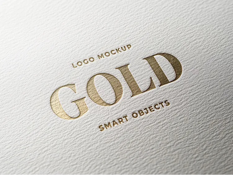
Restraint deserves to be treated as a design principle in its own right, not simply the absence of decoration. Deliberately choosing not to add another embellishment, another color, another decorative flourish, is itself a design decision, one that requires just as much skill and judgment as choosing what to include in the first place.
This principle shows up clearly in well-executed applications of premium finishing details. Materials like gold lettering business cards demonstrate restraint effectively when the gold detailing is limited to a specific, meaningful element, a name, a title, rather than spread liberally across the entire design. The restraint itself is what allows the premium material to actually register as premium, rather than blending into an already busy visual field.
Examples of Well-Balanced Luxury Branding
The most consistently well-regarded luxury branding across industries tends to share a common structural pattern: a simple, disciplined foundation, clean layout, restrained color palette, generous white space, elevated by one or two carefully chosen premium details. The contrast between the simplicity of the foundation and the specificity of the premium accent is what creates the impression of luxury, rather than any single element working in isolation.
By contrast, designs that struggle to land a luxury impression often share the opposite pattern: multiple premium elements competing for attention within the same design, none of them given enough visual space to actually register as special. Metallic accents, ornate typography, and heavily textured materials, when combined without restraint, tend to cancel each other out rather than compounding into a stronger overall impression.
A Simple Test for Whether a Design Choice Works
A useful practical test for evaluating whether a particular luxury design choice has crossed into excess is to ask what would happen if it were removed. If removing a specific element would leave the design feeling notably weaker or less distinctive, that element is likely doing genuine work and earning its place. If removing it would have little noticeable effect, or if the design would actually feel cleaner and more focused without it, that’s a strong signal the element isn’t contributing as much as it might seem, and may be tipping the overall design toward excess.
Applying this test element by element, rather than evaluating a design only as a finished whole, tends to surface exactly which choices are pulling their weight and which are simply adding visual noise.
Discipline as the Real Marker of Luxury
The fine line between elegant and excessive ultimately comes down to discipline. Genuinely luxurious design isn’t defined by how much premium material or embellishment is present, but by how precisely those elements are deployed. For designers and business owners alike, learning to recognize and respect that line, resisting the temptation to add just one more premium touch, is often the difference between a design that reads as genuinely sophisticated and one that undermines its own ambitions through excess.